Spotify
Logo Reveal | Illustration
About
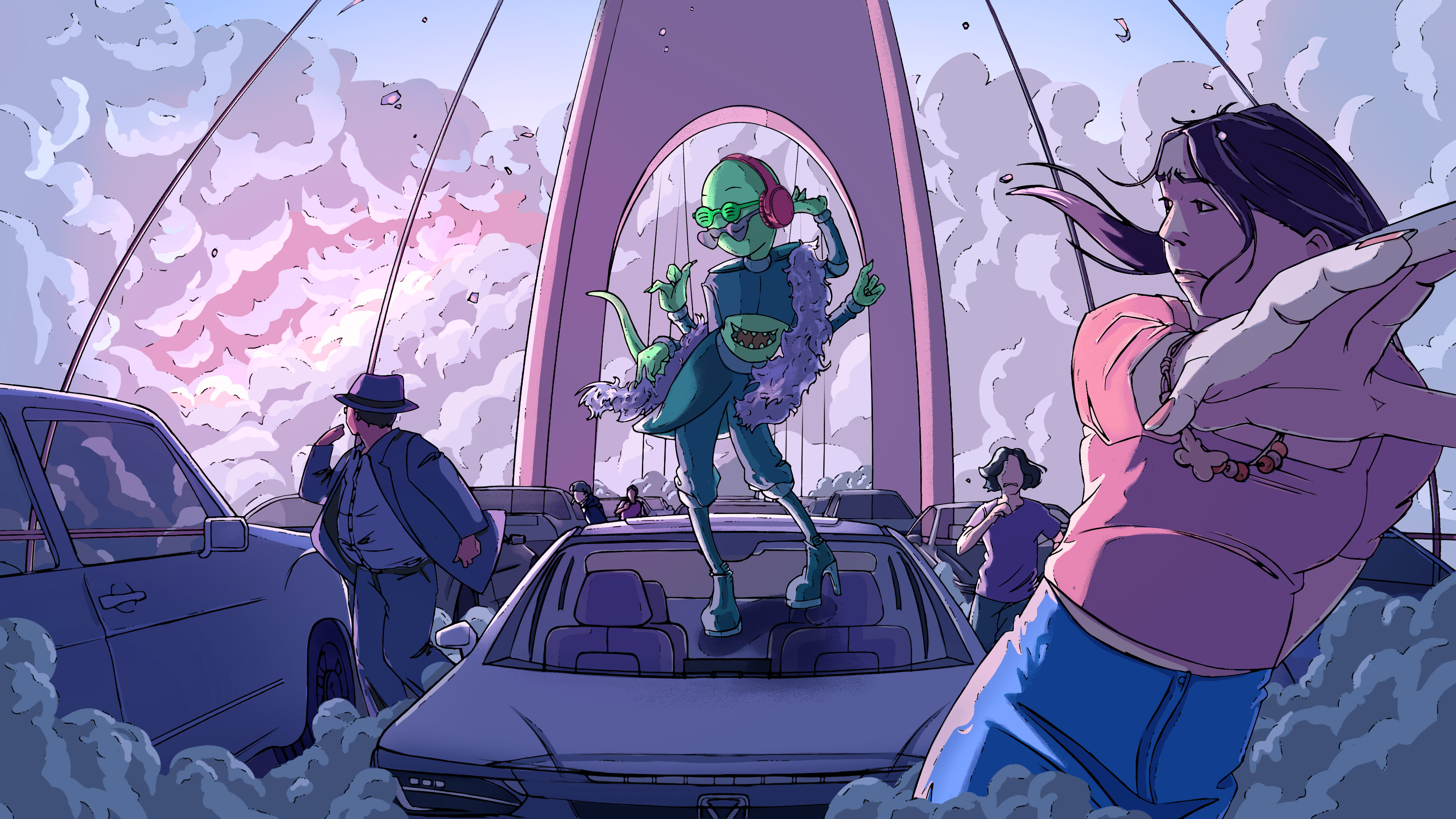
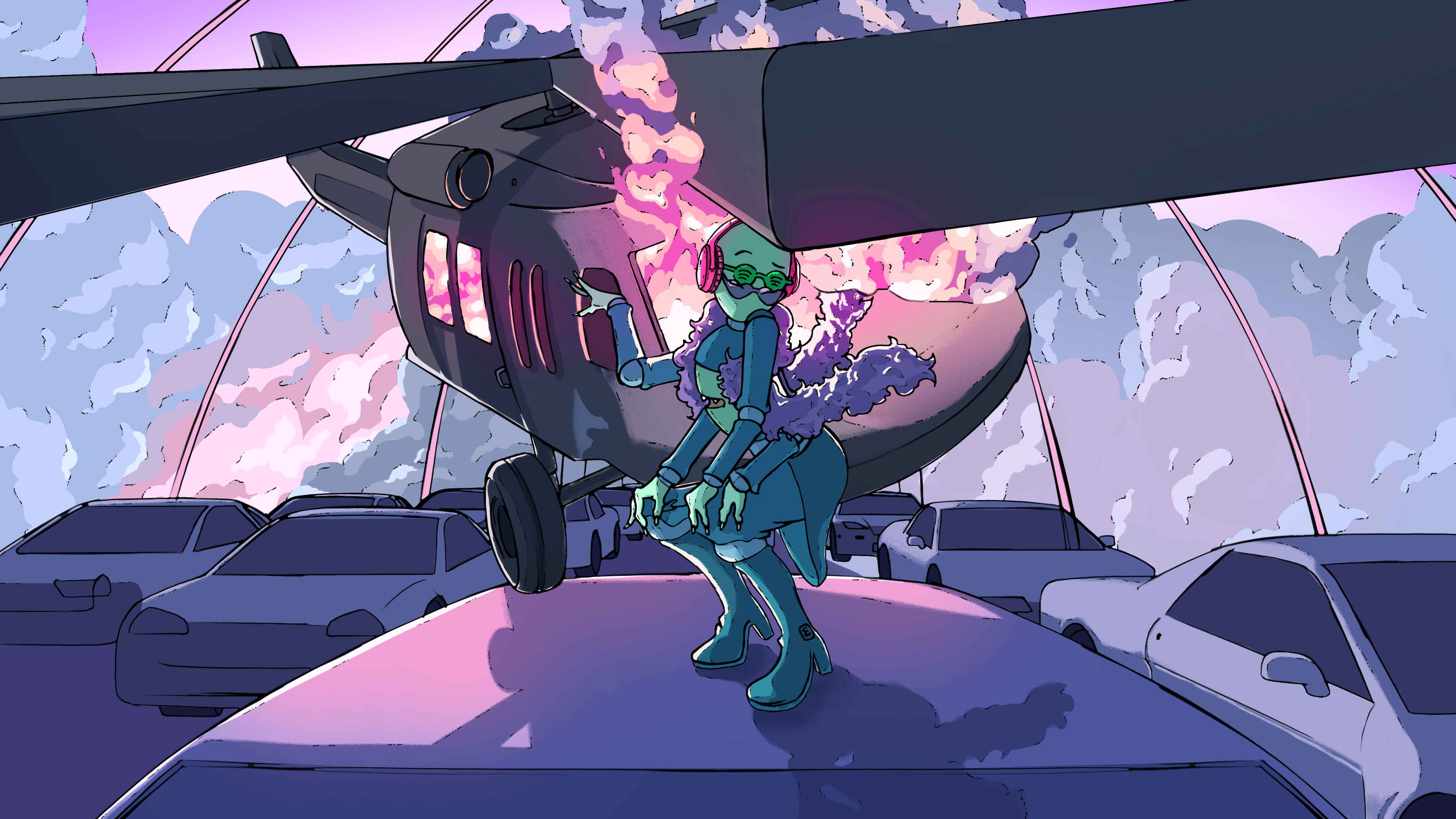
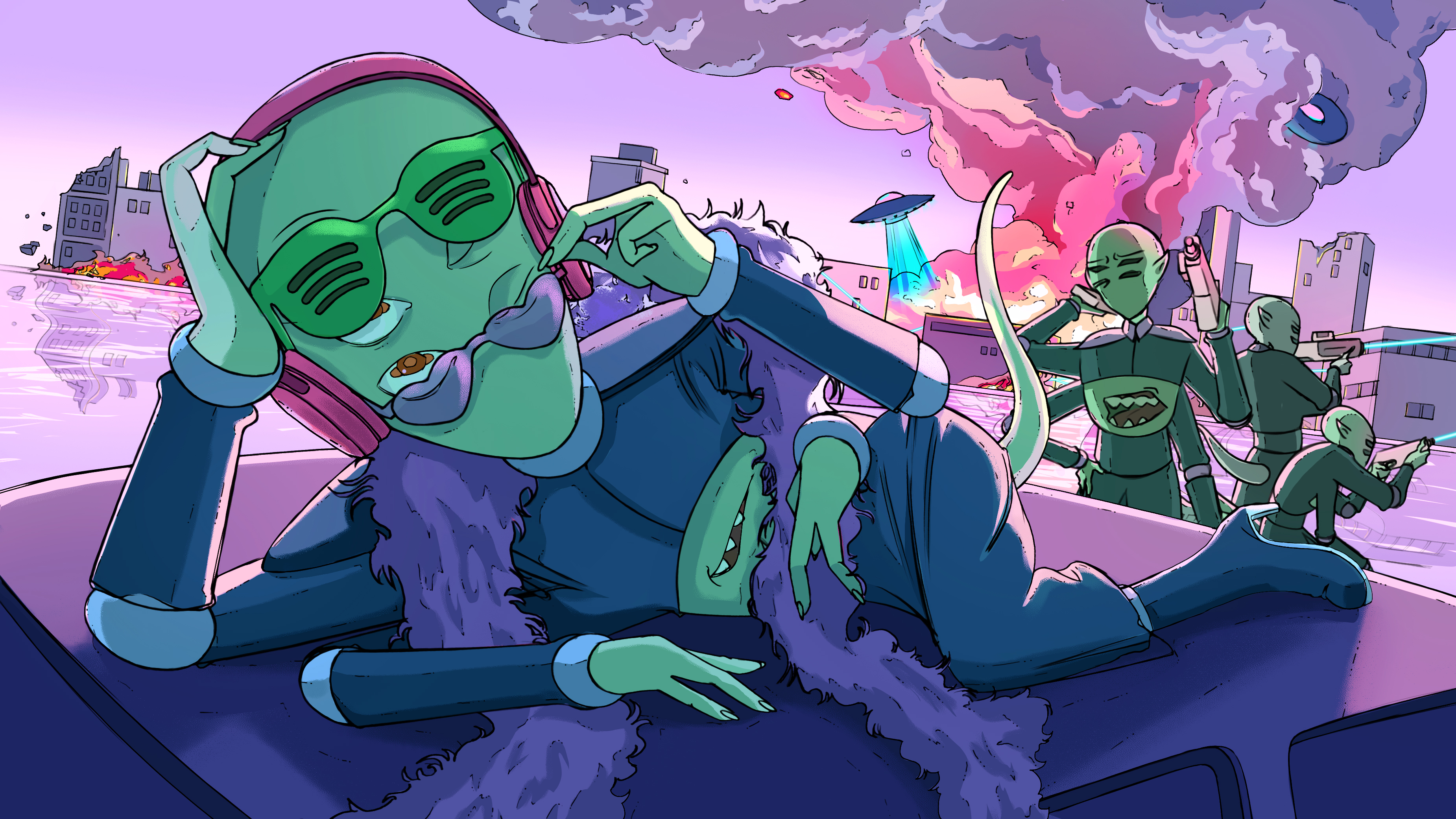
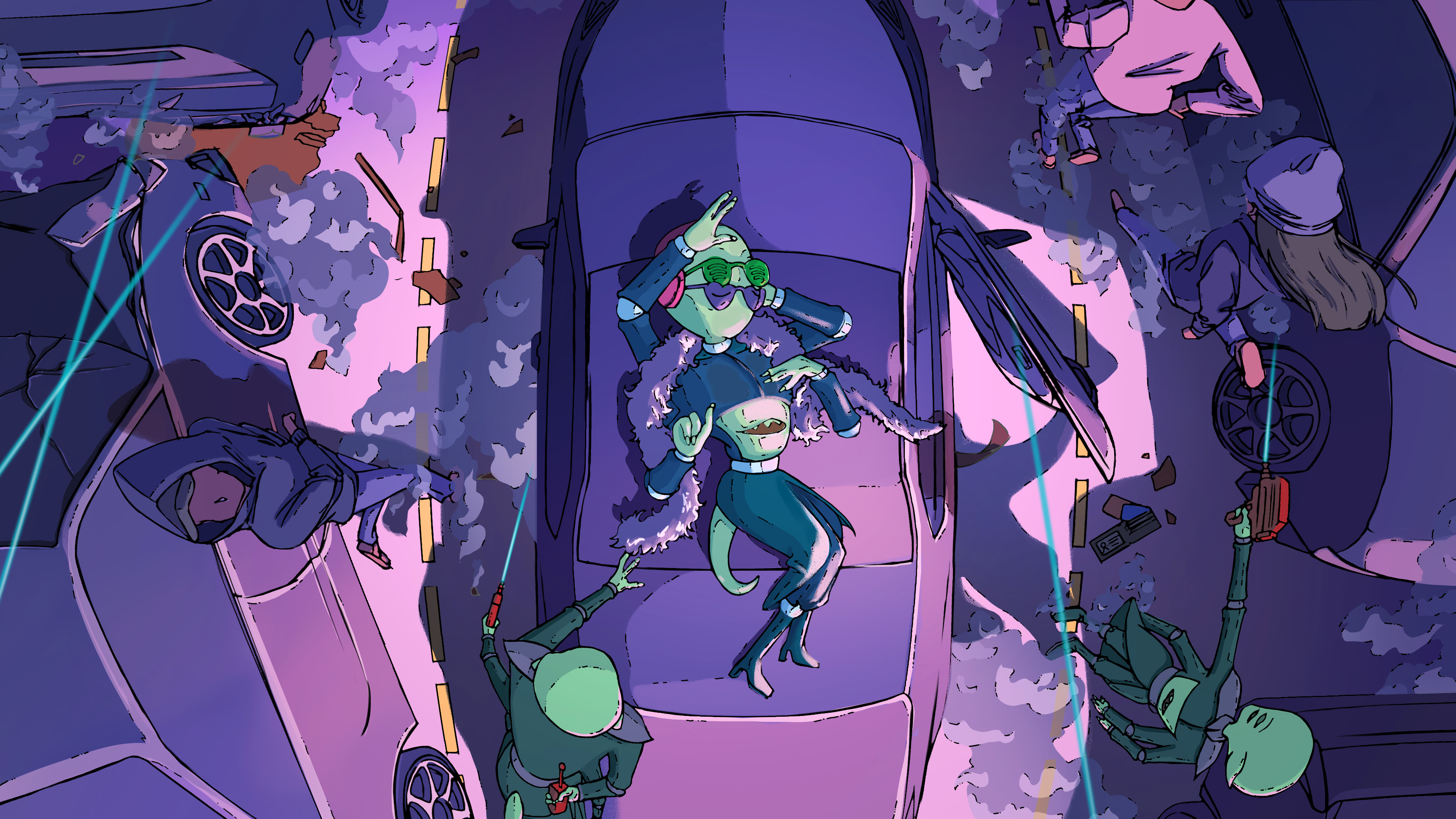
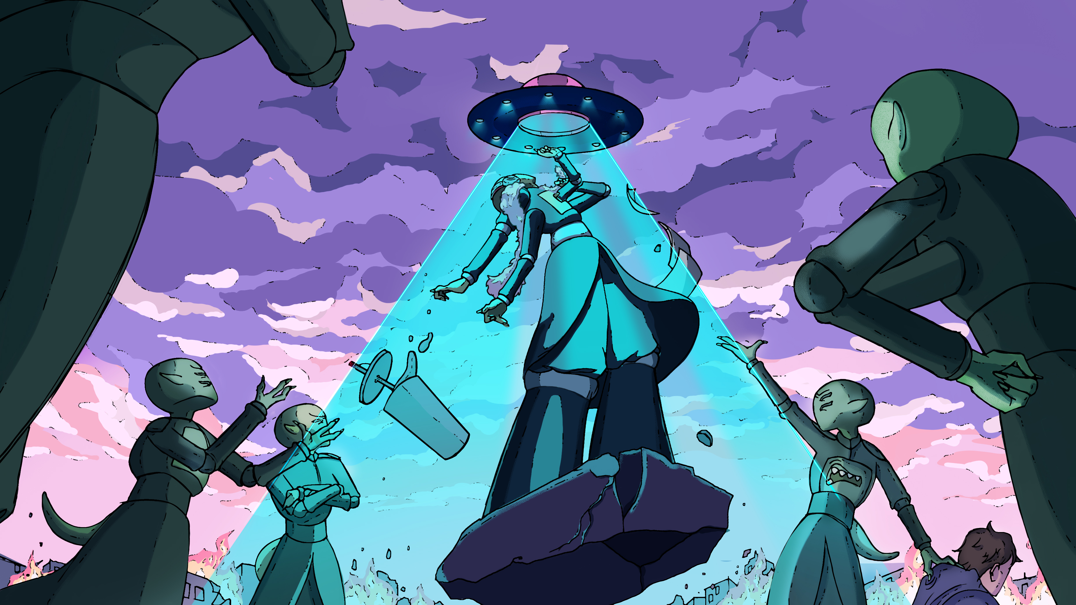
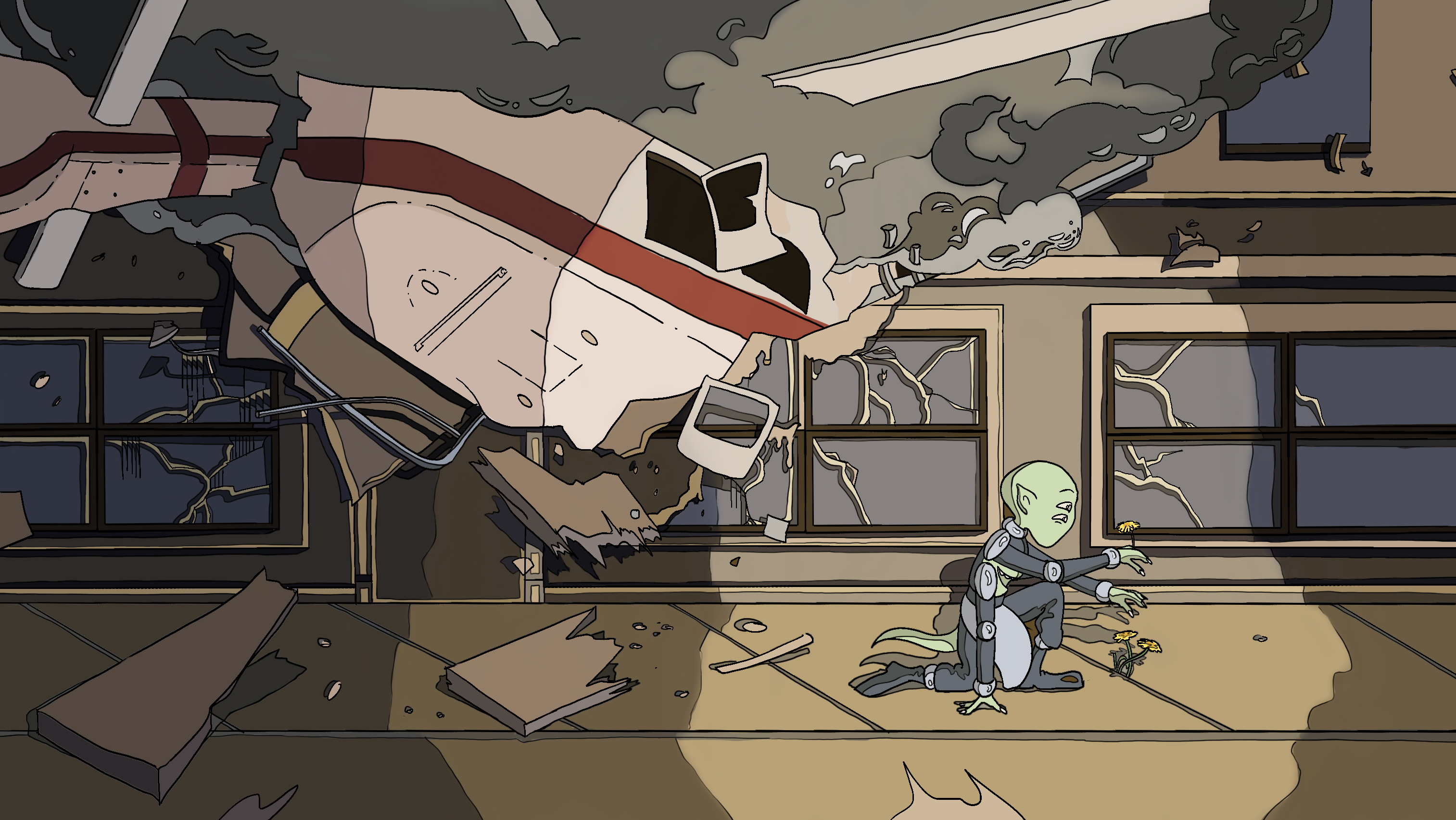
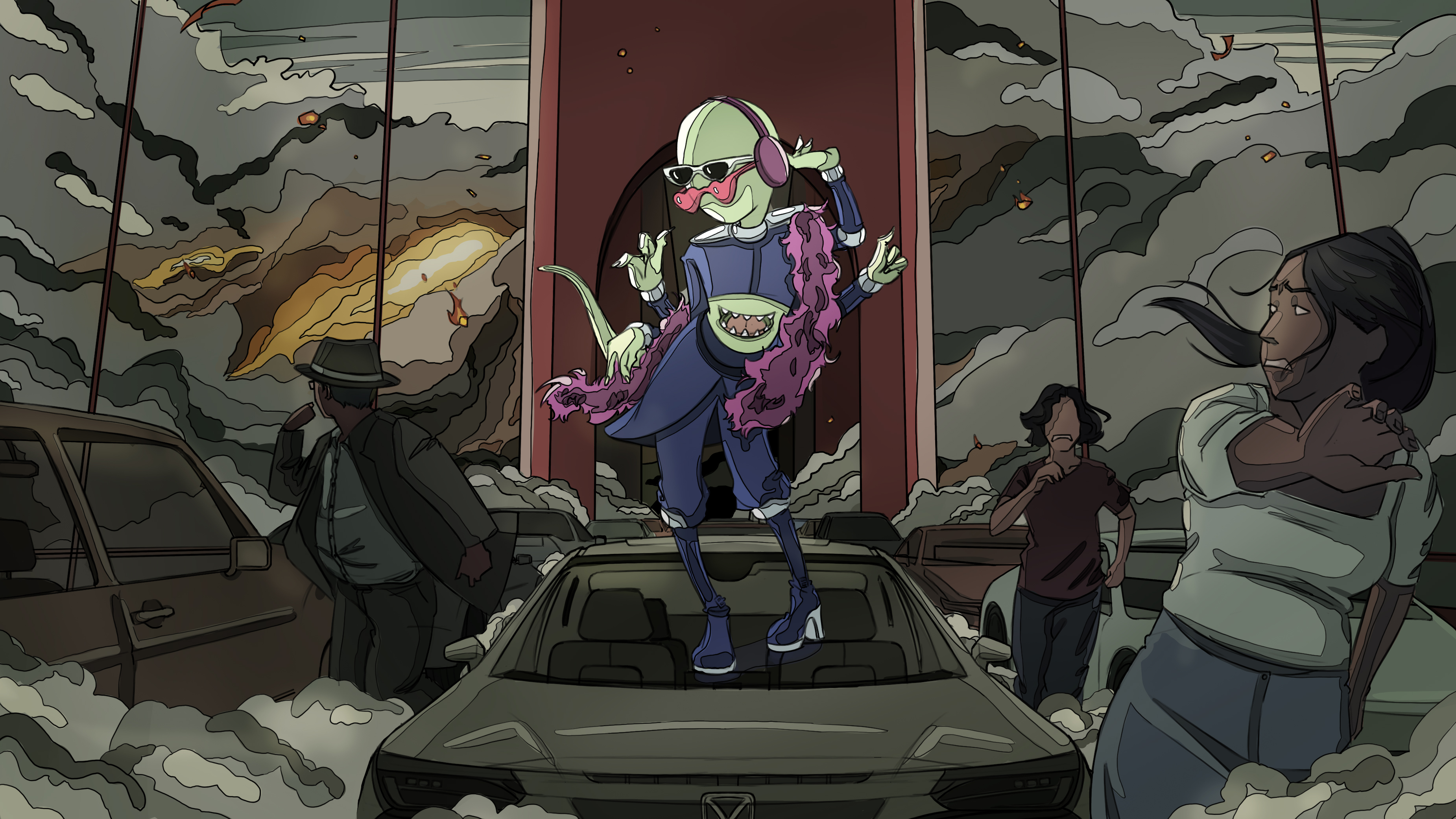
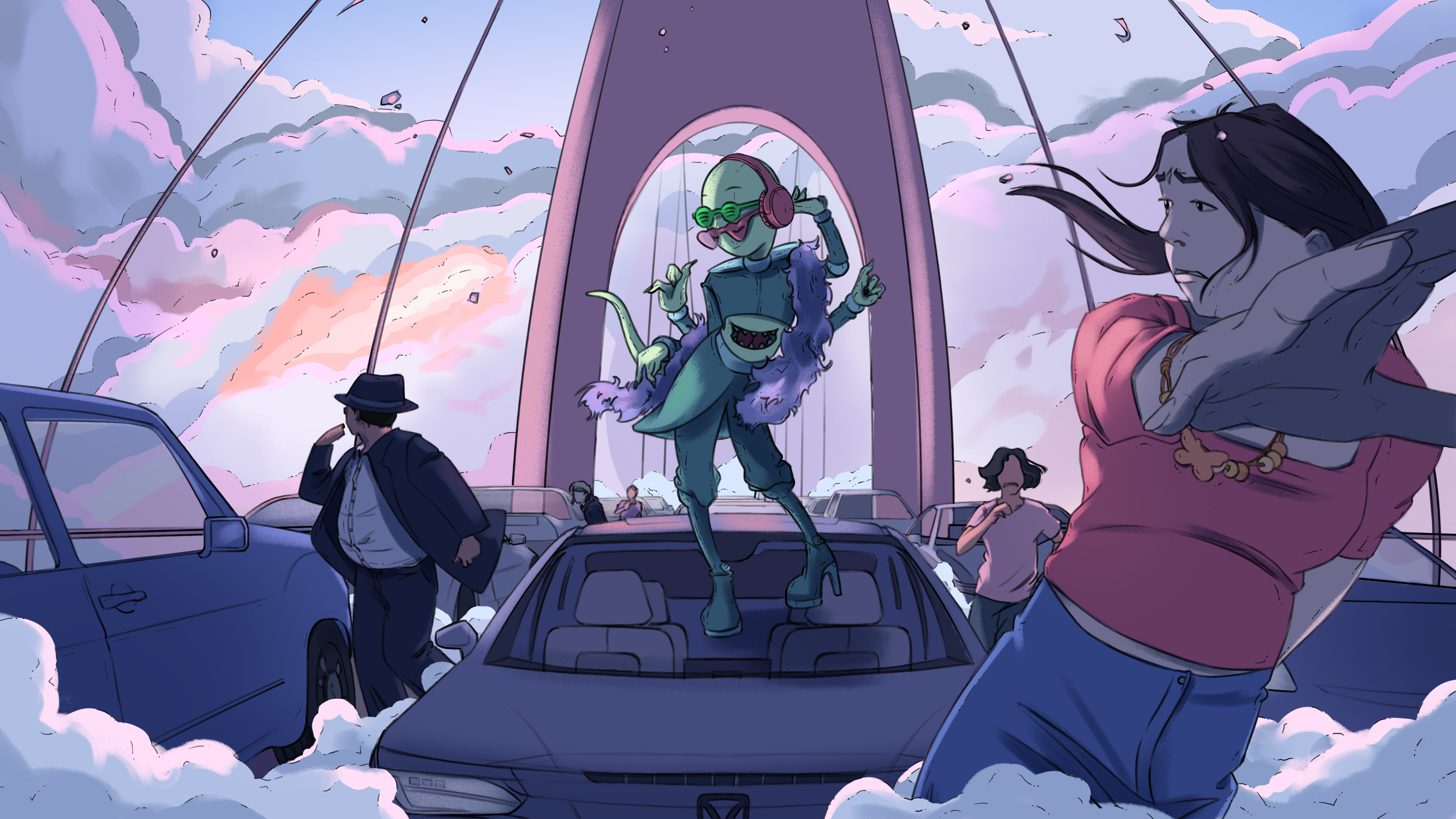
This one-minute ad for Spotify focuses on the immersive power of music through a fun-loving diva alien named Rory. After all, what better way to celebrate the year of 2023 than another catastrophic event? Enter: alien invasion. While his military coworkers are engaging in world domination in the background, Rory is distracted by his discovery of human music, narrowly avoiding the explosions and disasters happening around him. As he’s beamed back to his spaceship for failing to properly complete his job of invading Earth, the Spotify logo is revealed in his sunglasses; the lens through which he views the world.Collaborators
Tara Lam ︎︎︎Role
Concept Development, Character Design, Prop Design, Color and TextureFinal Frames


Development

Character Design
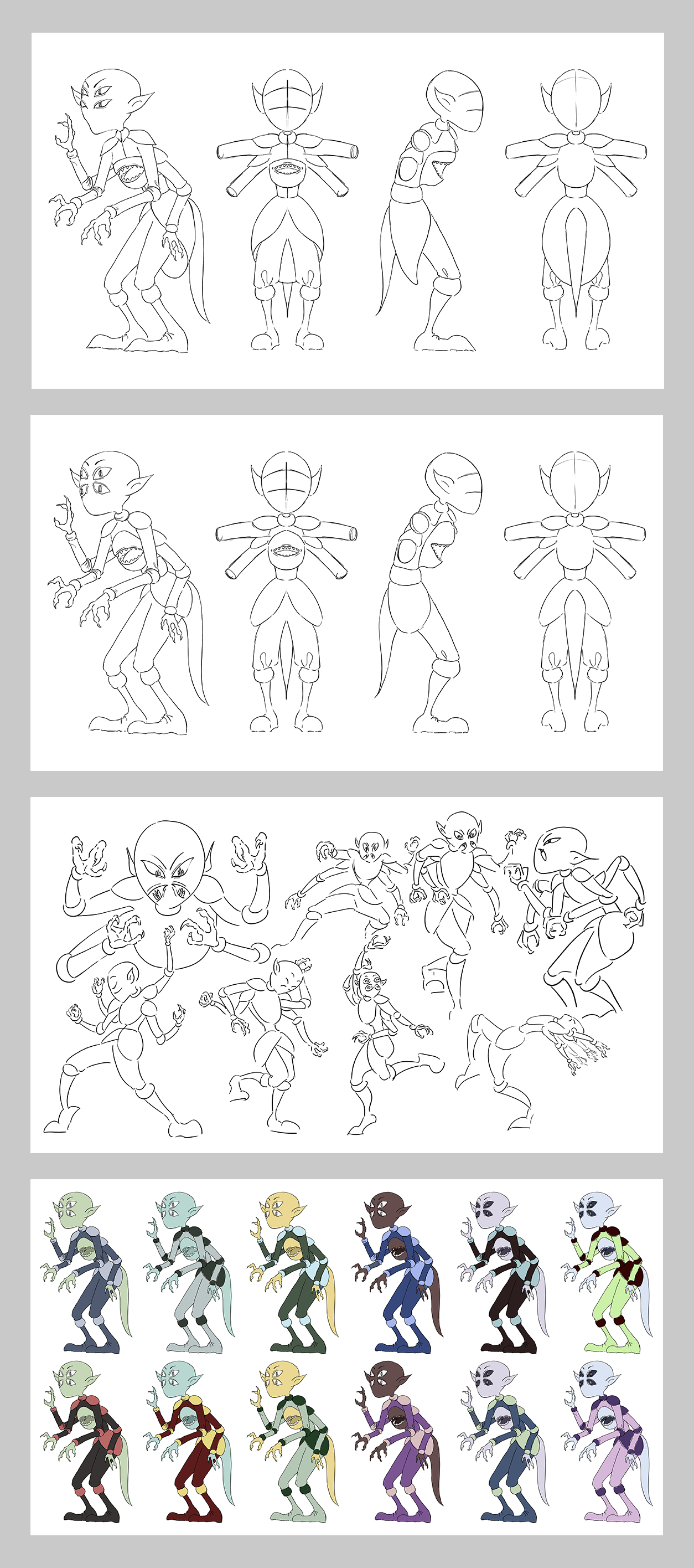
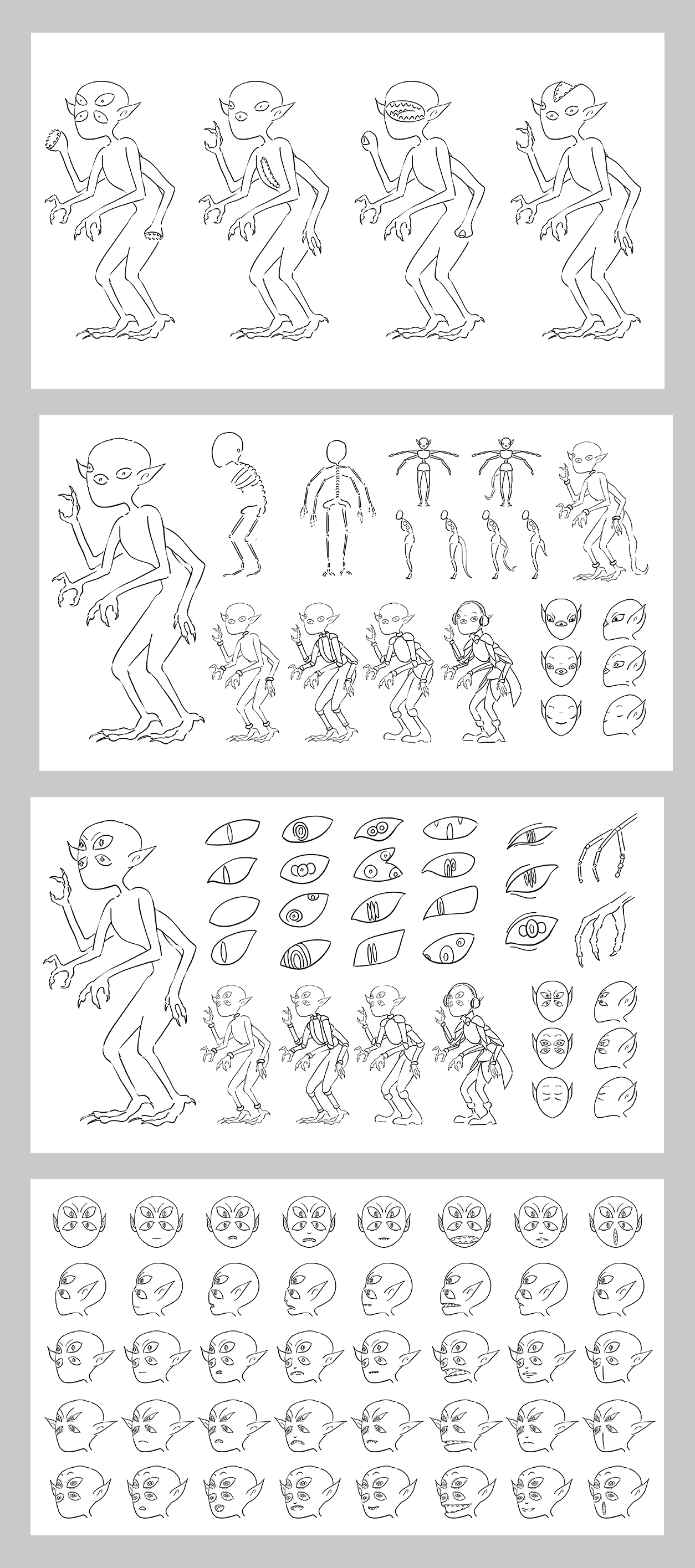
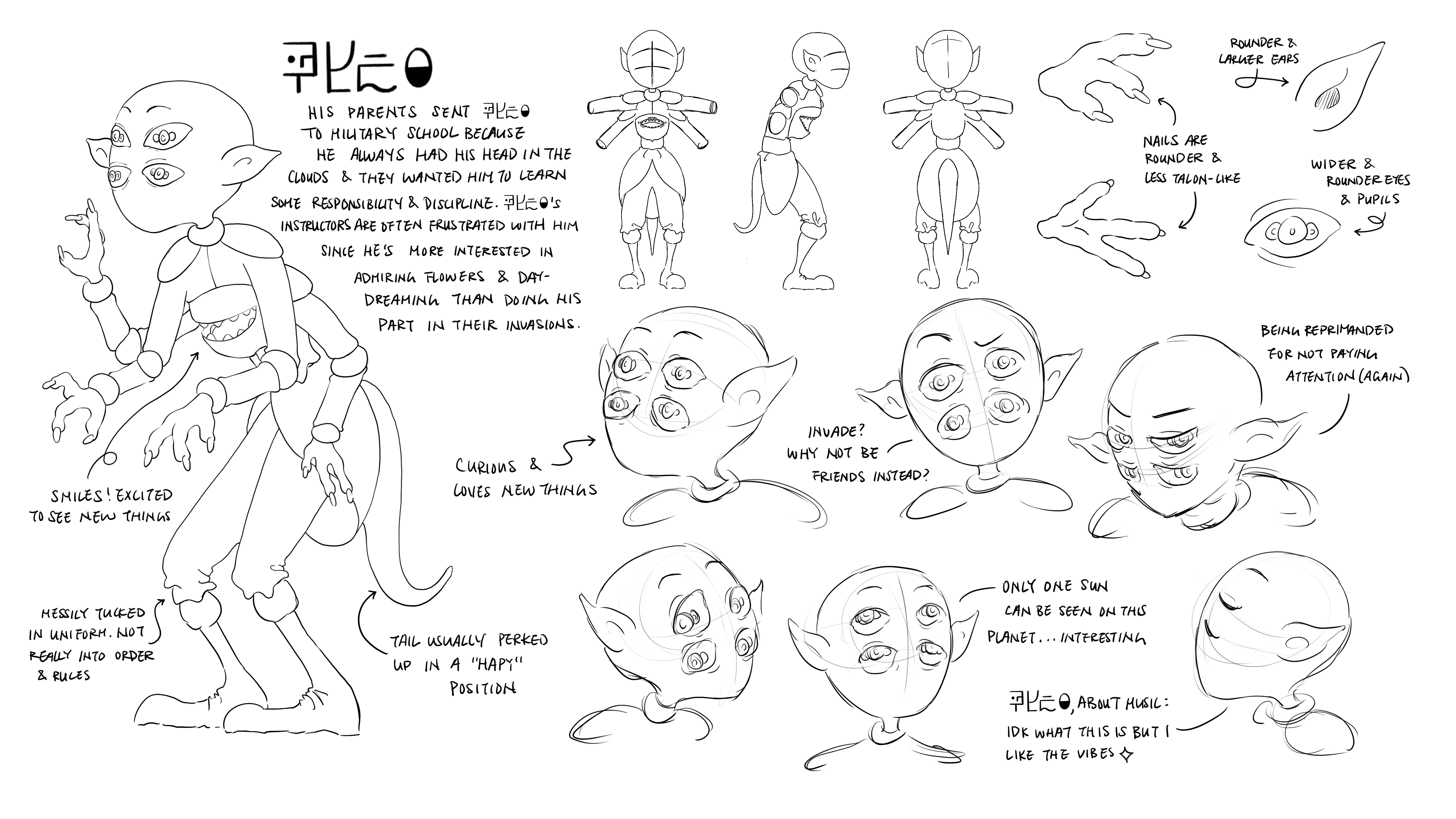
In early development stages, we discussed what type of protagonist would be most fascinating to build the entire concept and story around, leading to the decision to design an alien main character. I was in charge of the character design, creating the first few sketches inspired by underwater creatures and insects. We ultimately decided that a more humanoid, friendly character would be better for connecting with the audience.
We went through several rounds of revisions before finally landing on a design we were satisfied with, using the rounded features of the character, now named Rory, to differentiate from the other aliens in the invasion.
Prop Design
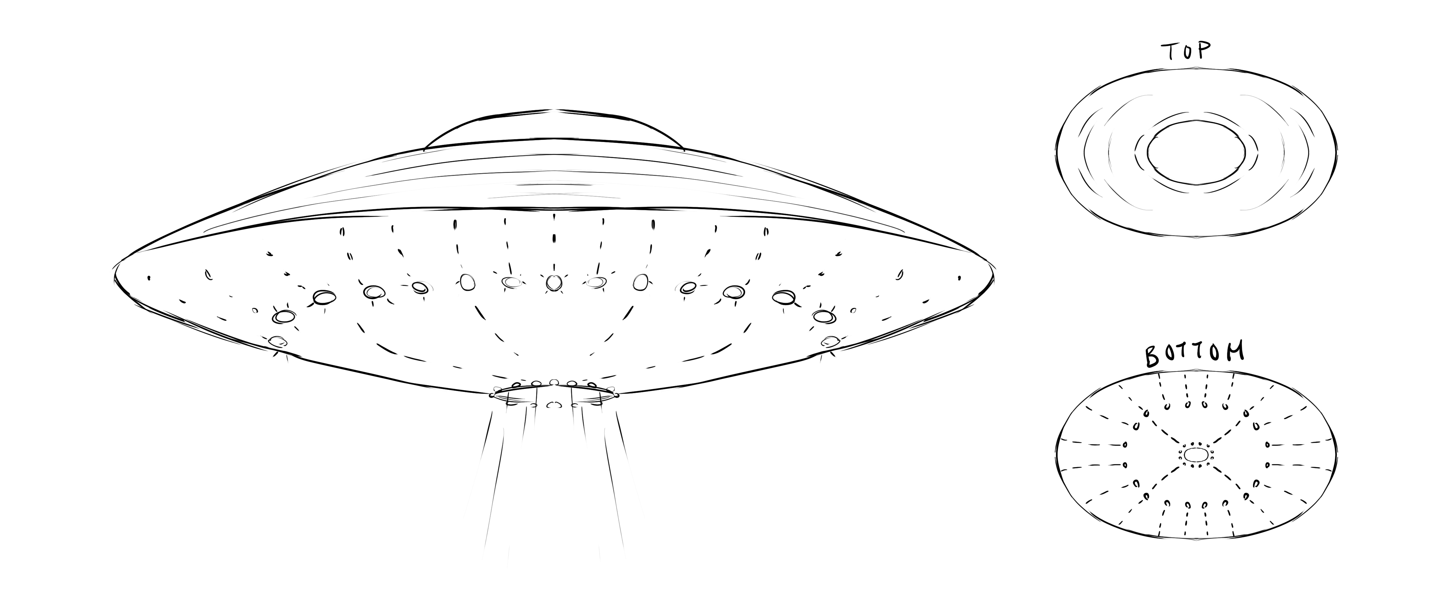
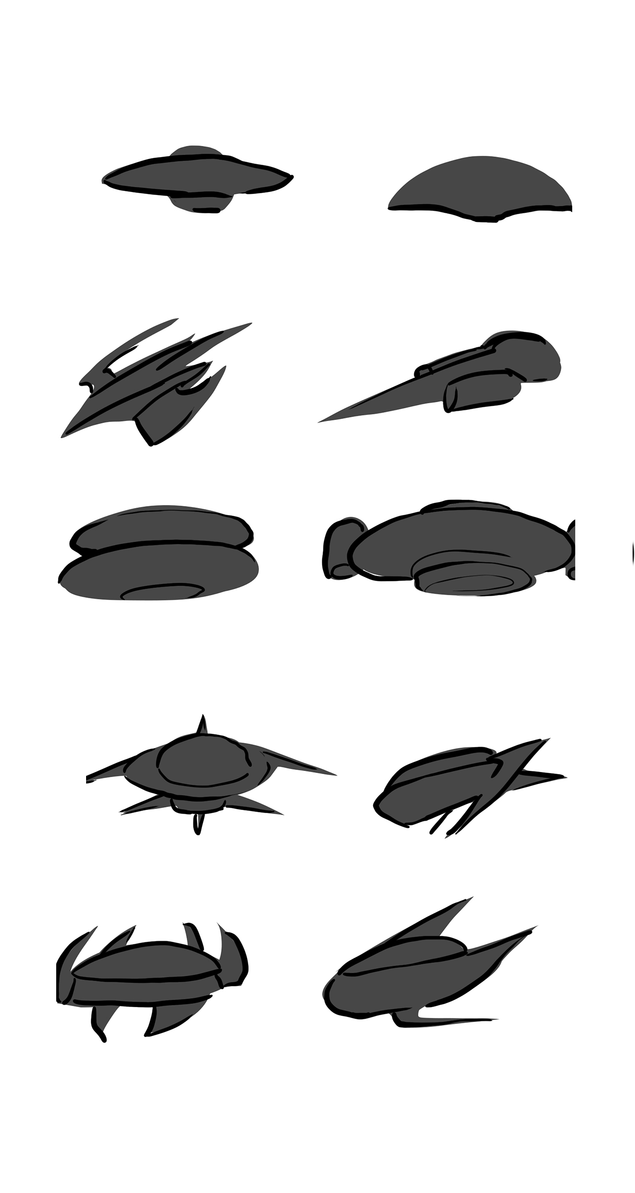
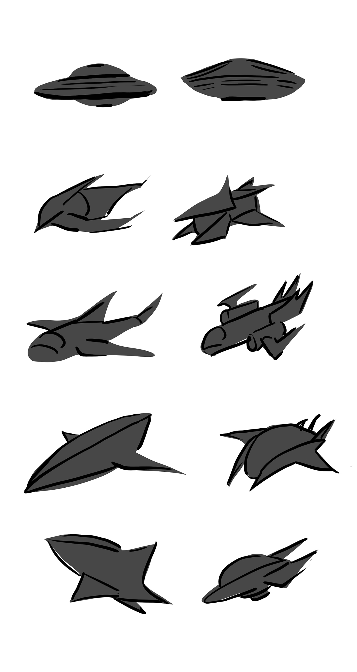
Along with character design, I was tasked with prop design. After some exploration on potential spaceships, we decided to stick with the classic and most easily recognizable UFO design. This way, the distinctive shape would be easy to notice even in the background.
With weapons, we took inspiration from candy guns and laser guns, which we felt would help emphasize the surrealness of the story.


Storyboarding
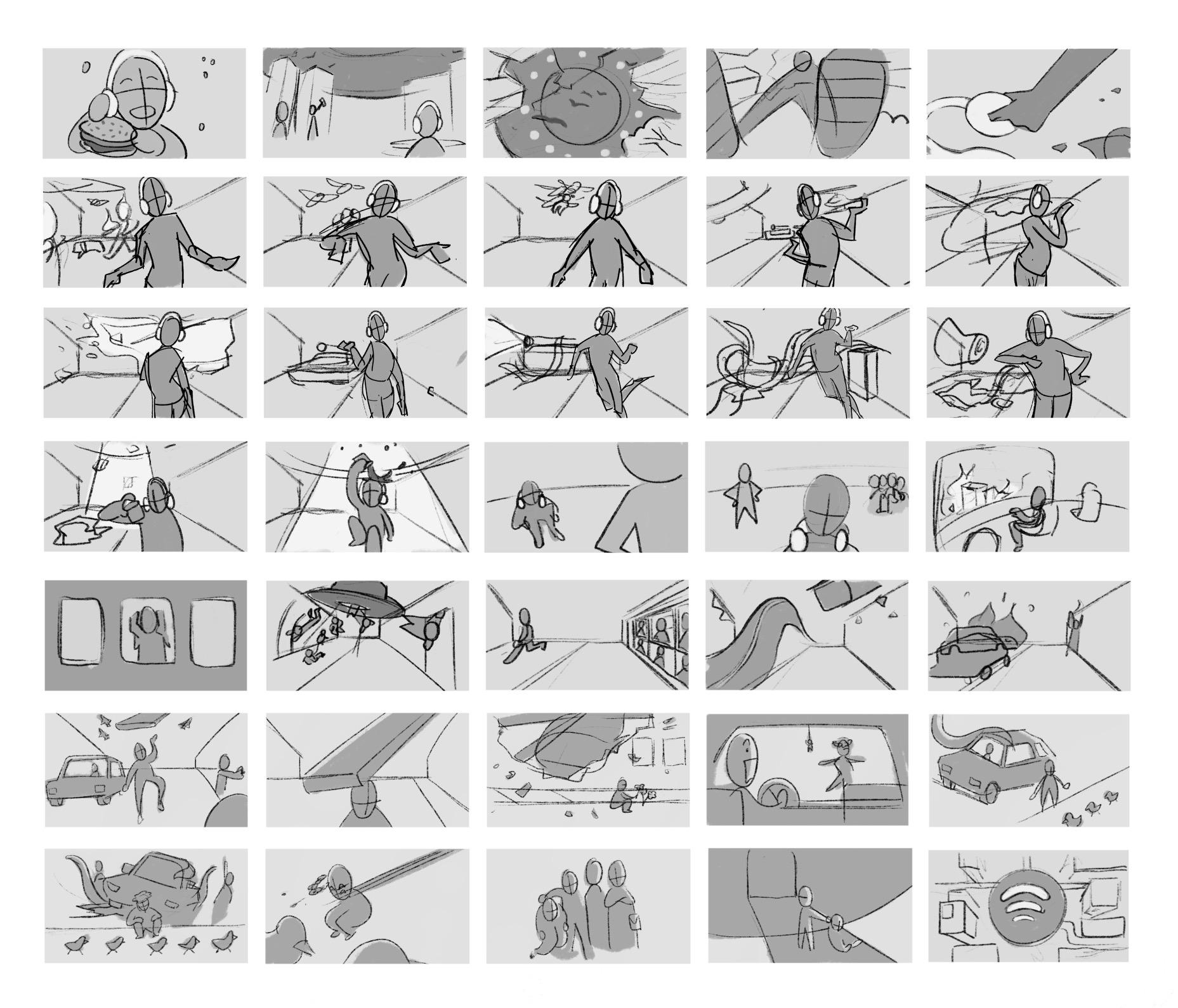
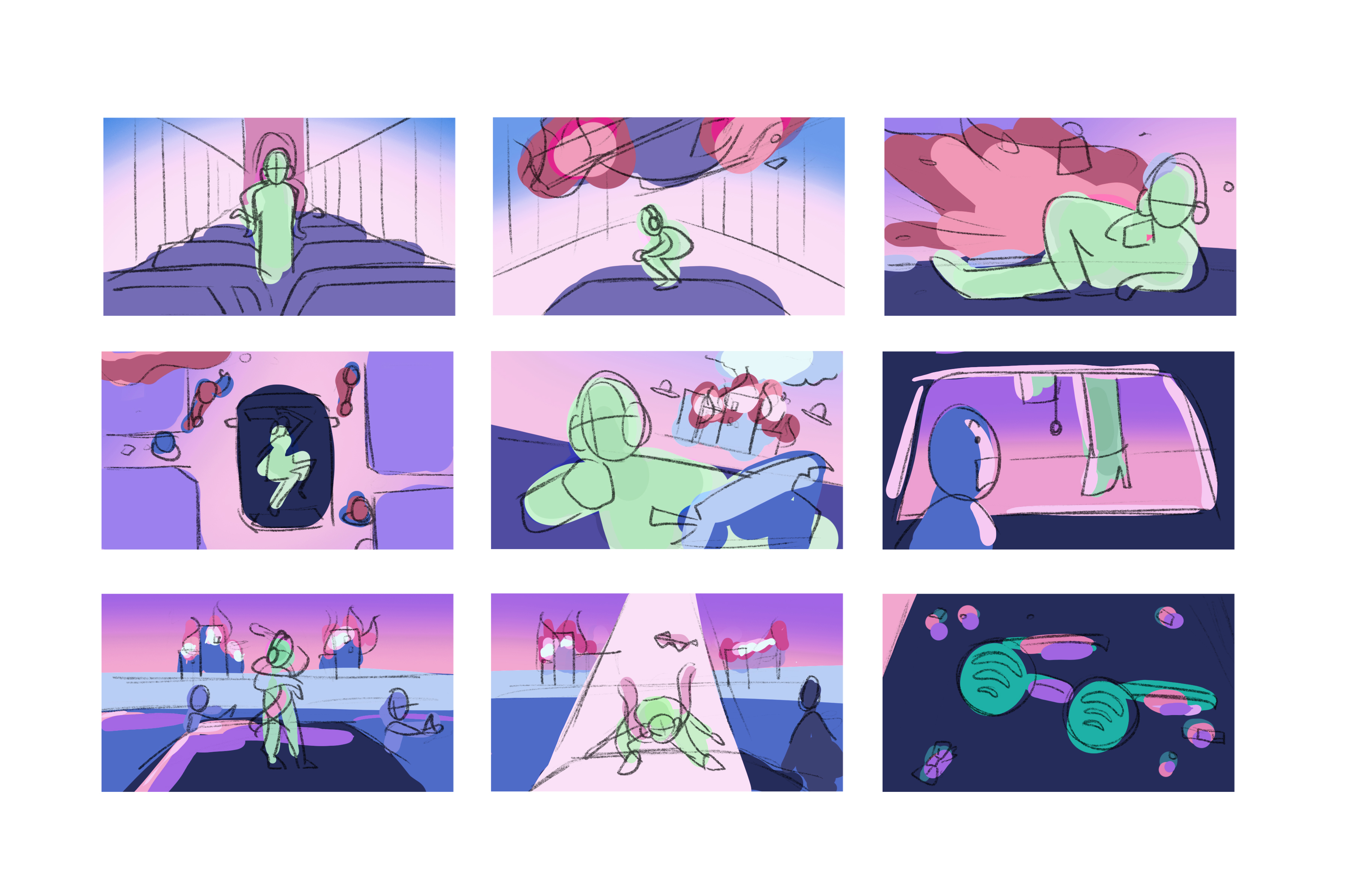
Tara took the lead in storyboarding. We first explored how Rory’s nature would lead to absurd and silly scenarios, mostly involving scenarios with human objects that an alien species wouldn’t have understood. After brainstorming and sketching out our favorite and most interesting interactions, we chose the ones that stood out the most and worked best together.
Color
As we explored different color palettes, we found ourselves leaning towards the brighter colors. Darker colors felt too muddy and dark, and we were aiming for absurd and satirical. Since we decided to go for a music video feel, we then looked into and referenced many music videos.
In the end the final color palette we chose was one we called the “Bubble Gum Space Pop Palette,” with colors associated with intergalactic scenes and bubblegum music.




Putting It All Together
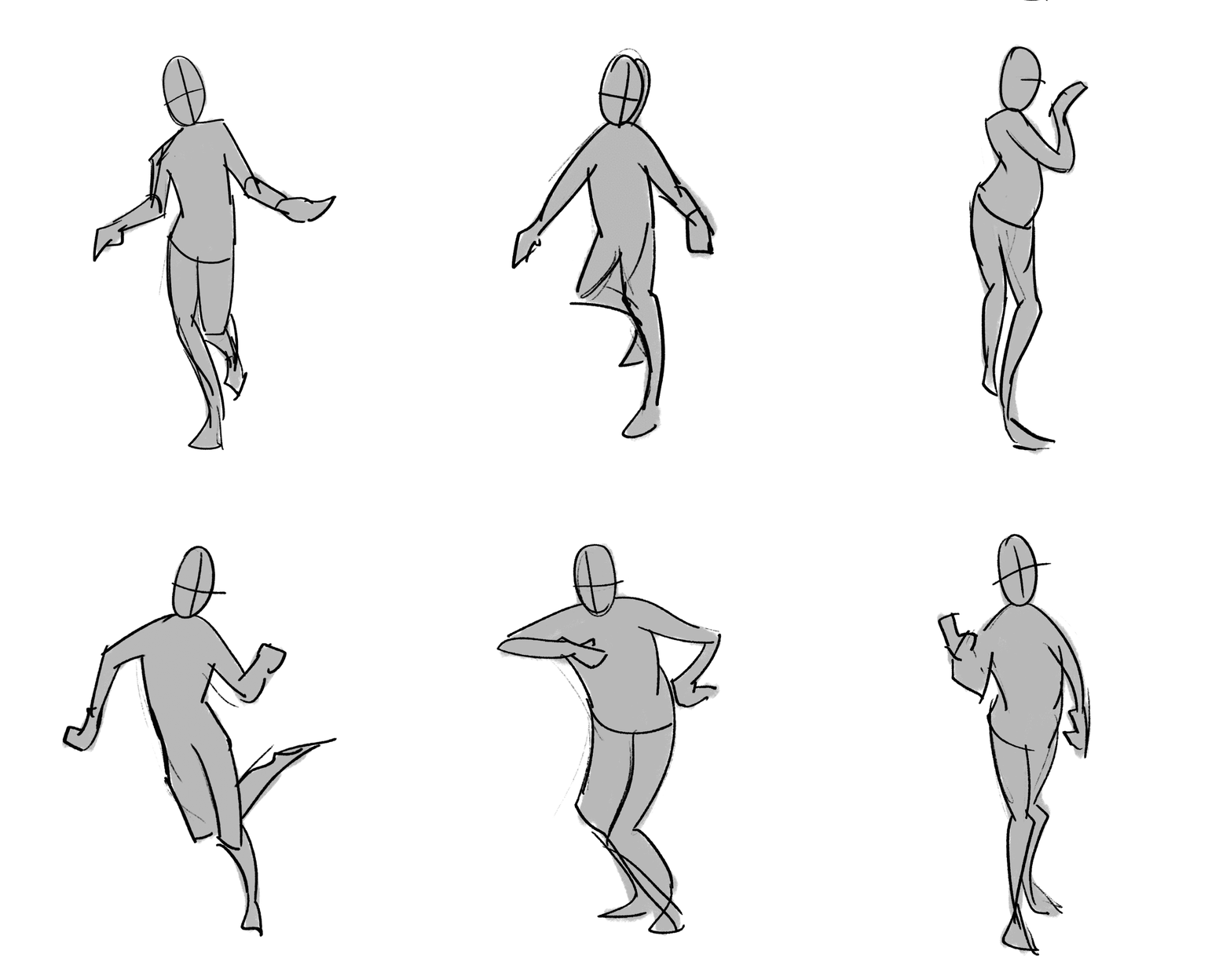
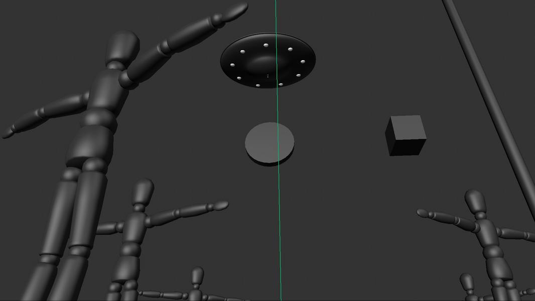
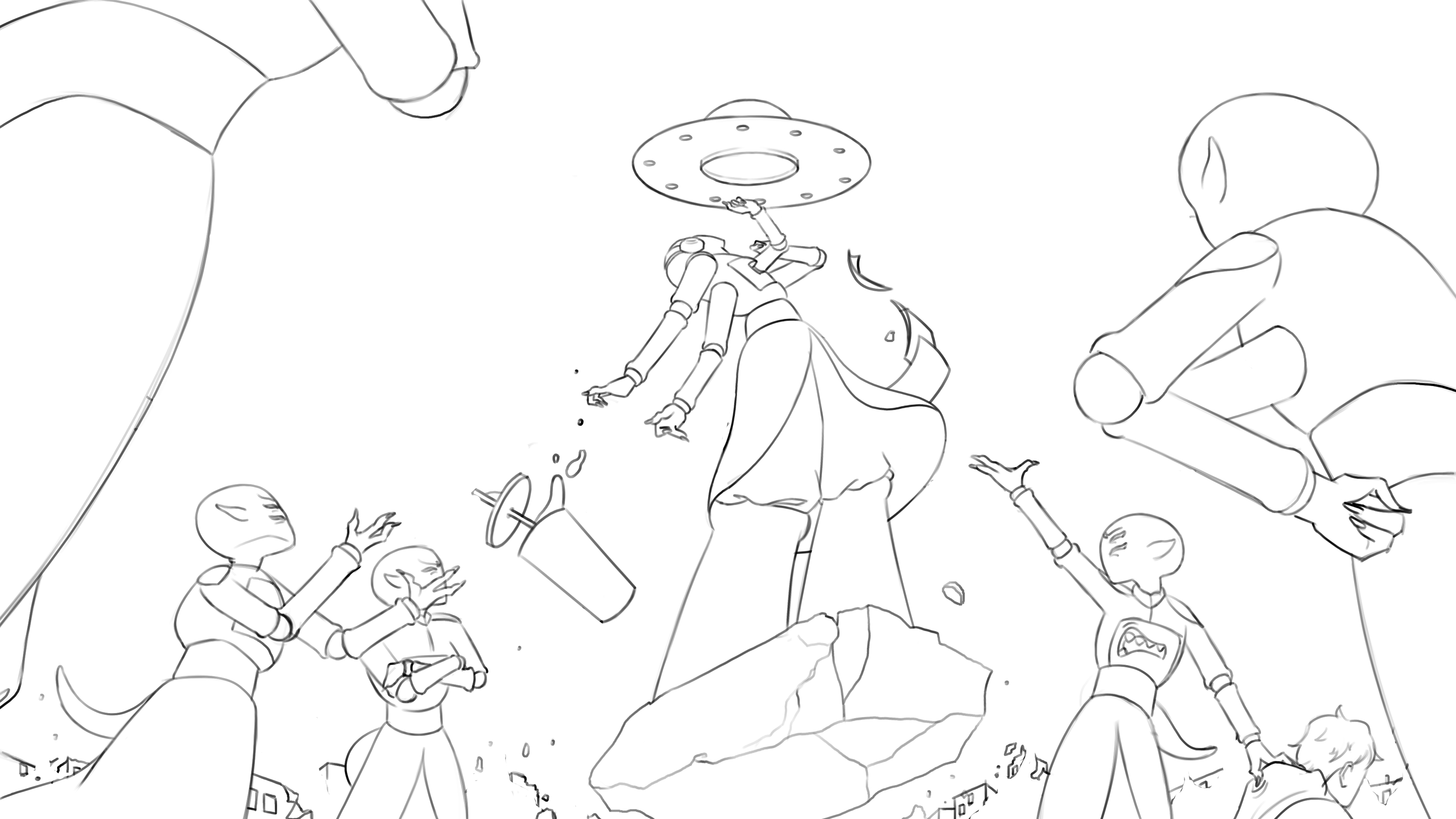
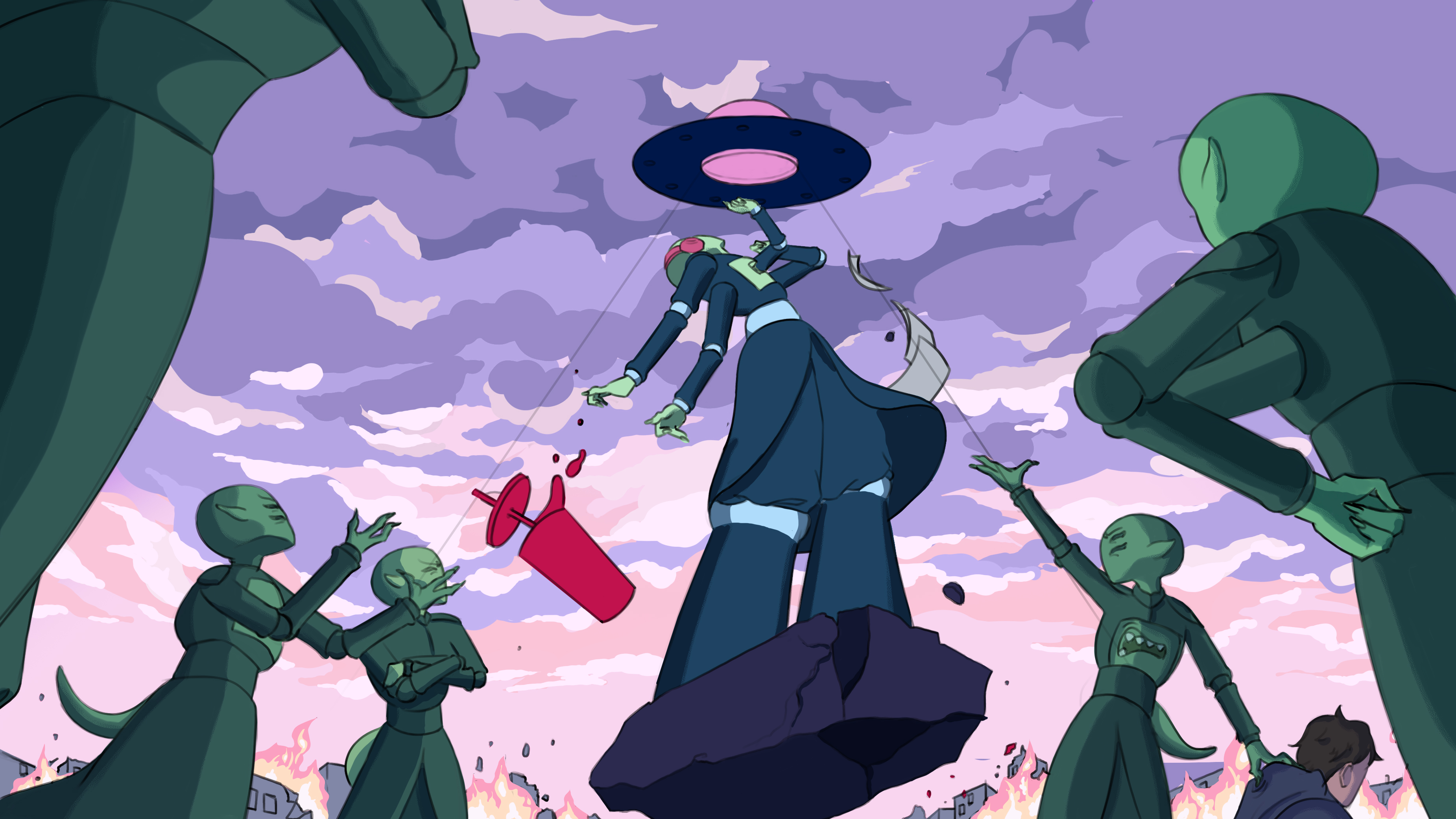
The final steps involved using a combination of models Tara built in Cinema 4D and our own poses as reference. Tara then lined the artwork and passed it back to me to handle the coloring, and final texturing.
The final steps involved using a combination of models Tara built in Cinema 4D and our own poses as reference. Tara then lined the artwork and passed it back to me to handle the coloring, and final texturing.
Final Frames
